




The colors mean something
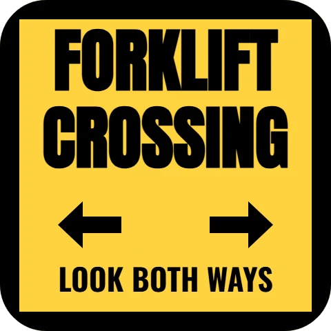
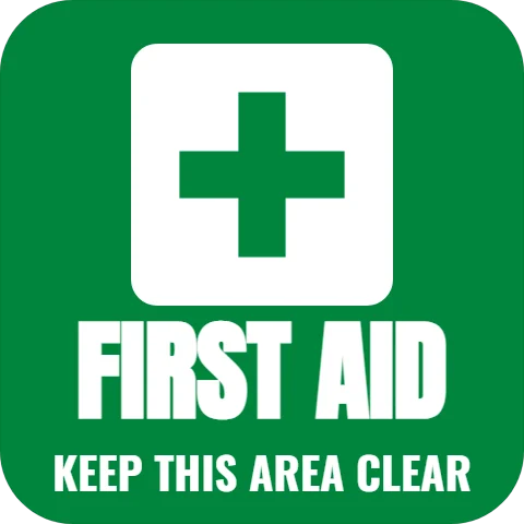
OSHA assigns colors to safety messages in the workplace: red for fire protection equipment and danger, yellow (or yellow and black) for caution and trip hazards, green and white for safety instructions and first aid. The templates follow that code: "keep clear" in red in front of an extinguisher, "watch your step" and "caution, slippery when wet" in yellow and black, first aid in green and white.
Where they go
- Keep clear, fire extinguisher: on the floor in front of each extinguisher and alarm pull, as a reminder.
- Watch your step at a change in floor level or a step down.
- Forklift crossing where pedestrian aisles cross forklift routes.
- Hard hat area at the entrance to the zone that requires one.
Informational, not official
Printed floor graphics remind people; they are not a substitute for the signs, aisle markings and equipment OSHA or the fire code require. In warehouses and shops with carts and forklifts, choose the rugged textured material, and replace a decal once it wears.
From the shop: Replace safety decals as soon as they wear. A faded caution mark teaches people to ignore the next one.