






A style for every line
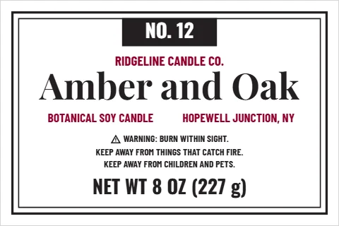
- Apothecary: hairline frames and a numbered black tab, the scent in a serif; it stands tall for a taper jar too.
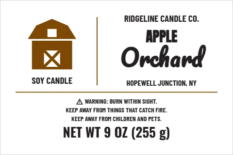
- Farmhouse kraft: a barn beside the scent, black and brown on brown kraft stock.
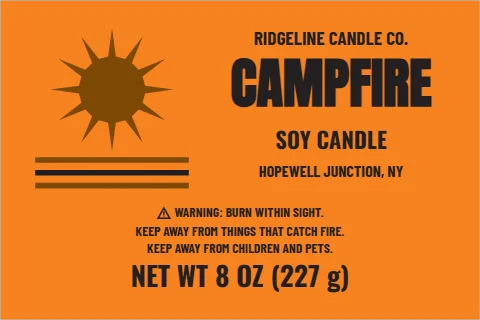
- 70s retro: a sun over three stripes on an orange ink.
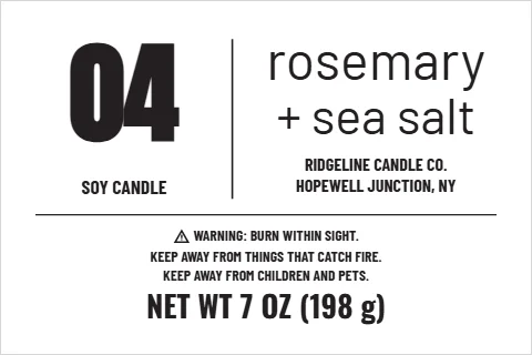
- Modern minimal: a big number and the scent in plain lowercase, in one black ink.
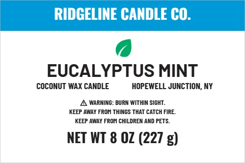
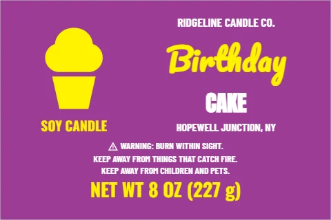
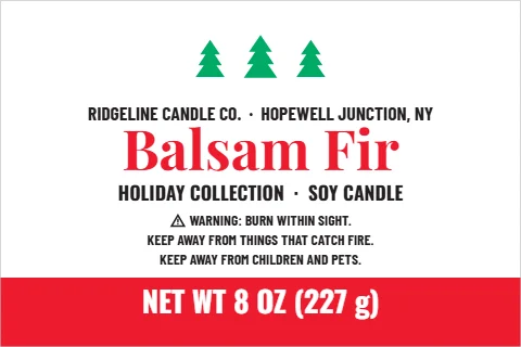
- Clean and fresh, birthday cake and holiday pines: for a spa shelf, a party favor and the December rush.
- Vintage tin lid: a burgundy double ring with the scent on a ribbon, for a 3 inch tin.
The warning, in words
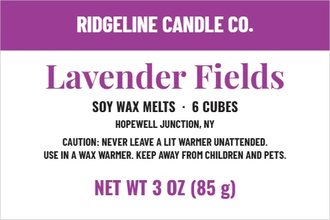
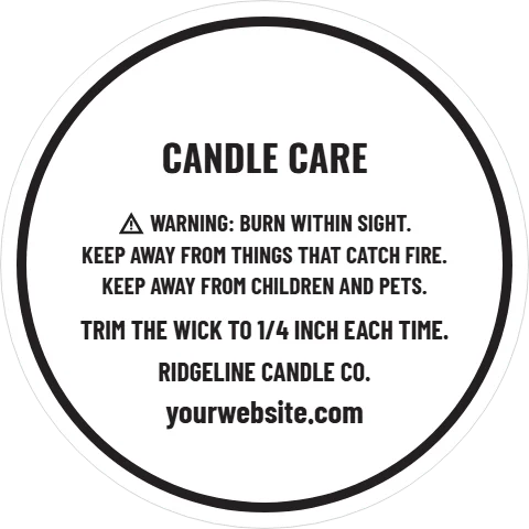
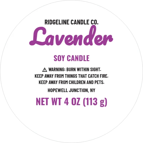
The candle templates follow the text form of the ASTM F2058 warning: the safety alert symbol, then WARNING and "Burn within sight", then "Keep away from things that catch fire" and "Keep away from children and pets". The standard is voluntary, but many shops that stock candles ask for it. The small 2 inch lid is too small for the warning, so pair it with a jar label or the bottom label. The wax melt design has a caution for warmers instead; check the wording that fits your melts.
Ordering them
Candle labels come on rolls in full color, from 25, or in solid inks, which ship free. Several styles print in a single ink or on kraft, which keeps a first run simple. For a small first batch, cut stickers from the sticker designer cost less for a short run.
From the shop: Burn one candle all the way down with its label on before you order a big run. You will see where the glass gets warm and where the label should sit.