



Less, placed well
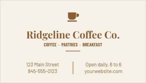
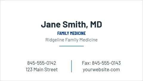
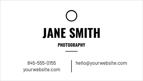
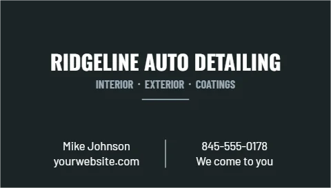
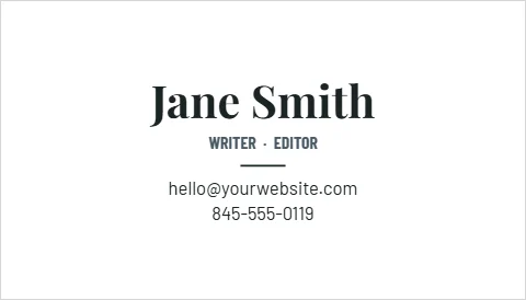
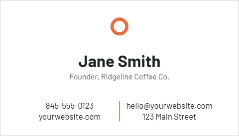
A minimalist card is harder to do than it looks: with so little on it, every line has to sit exactly right. The templates use a generous margin, a single typeface in two weights, and one accent color, often just a rule or the logo. Small type stays at 8 points or larger, because minimal should not mean hard to read.
Who it suits
- Creative work: photographers, writers, designers.
- Professionals: attorneys and physicians who want quiet confidence.
- Cafes and shops with a clean brand.
- Agents: the minimal agent card still carries the license type and brokerage New York requires.
Make it feel premium
On a minimal card the paper and finish do a lot of the work. Ask for linen texture or soft touch when you order, or rounded corners for a softer look.
From the shop: On a minimal card, print a test of the smallest line at full size and hold it at arm's length. If you squint, make it bigger.