




Why vertical
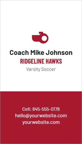
Most cards are horizontal, so a vertical card gets noticed. The shape suits a photo, a tall logo, or a name set big across the top with details stacked below. It reads the same size as a standard card and fits the same holders and wallets.
Layouts
- Agent with photo: a headshot on top, the name, license type and brokerage below.
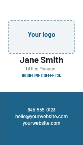
- Logo on top: the mark in the upper third, details stacked beneath.
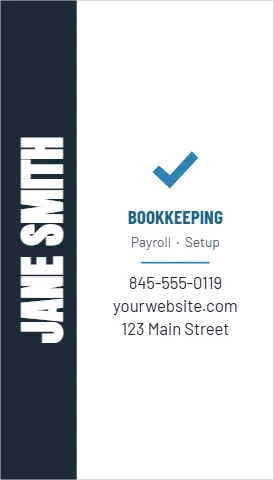
- Name up the side: the name runs vertically along one edge.
- Initials in a disc: a monogram for a personal brand.
Mixing orientations
A vertical front can have a horizontal back, or the other way around; set each side in the designer. The same bleed and safe area rules apply: a quarter inch margin for text, and backgrounds past the edge.
From the shop: Check the card in a cardholder: most hold cards horizontally, so a vertical card sits sideways. It still stands out, which is the idea.